

The Middle Earth map I fell in love with
The Middle Earth map I fell in love with
Pauline Baynes' started it all

Today I want to make a little diversion and talk about the one of the finest fantasy maps ever made.
Pauline Baynes map of Middle Earth
While the Lord of the Rings was still being prepared for publication, JRR Tolkien commissioned fantasy illustrator Pauline Baynes to paint a map of middle earth. She worked from a hand-drawn, heavily annotated map that Tolkien used when he worked. You can now see that map in Oxford University’s Bodlein Library. We have decades of iconic Middle Earth maps, but Pauline Bayes map was the first. It’s a testament that her map did so much to define the look, but also channeled Tolkien’s brilliance as well.*

Pauline Baynes’ map of Middle Earth
If you like this post, share it with someone else who will too.
Pauline Baynes is a fascinating person in her own right. She played a huge role in creating the initial visual tone for both Lord of the Rings and the Chronicles of Narnia. Read her Wikipedia entry for a look at her long and varied life.
I will always think of Pauline Baynes’ map as the best map of Middle Earth ever made. The vignettes have interpretations of locations from the story, including obvious ones like Minas Tirith, and less obvious ones like the Barrow Downs. They s are subtly color coded to the map dot for each location to help you find them on the map. The style is iconic and the colors are magical.
This poster was on my brother’s bedroom door growing up. I remember staring at it and imagining what it would be like to visit those places, even before I read the book itself.
The marching forces of evil at the bottom and the fellowship at the top contribute to the dynamic feel of the map. Tolkien’s base map full of motion and Baynes takes this virtue and makes it the core of the picture. And that lurid green—a bizarre choice for a map dominated by the sea, but it lends an otherworldly magic to Baynes interpretation and makes the few splashes of color, such as the major cities and the fellowship themselves, stand out.
The magic of assemblage
In the 1970’s and 80’s, The Lord of the Rings did not have a unified look. If you were a Tolkien fanatic, you probably purchased the annual Tolkien calendar. This calendar featured illustrations by a parade of the best artists in fantasy. Everyone interpreted Tolkien’s world differently. It was a marvelous palimpsest where the characters constantly changed and grew before your eyes. When I think of Gollum, I see the Brothers Hildebrandt version of Gollum, but when I picture the Ringwraiths, I see the weird distorted horses from Baynes cover art for the original Lord of the Rings.
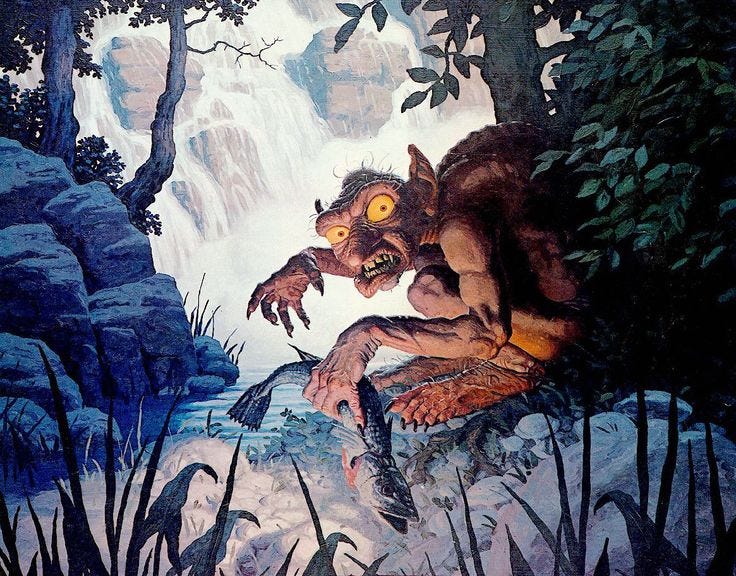
The Brothers’ Hildebrandt Gollum from the 1970’s
I love it when disparate pieces of art are allowed to come together in an assemblage that’s bigger and greater than the pieces. I am reminded of 2nd edition D&D, with its raffish assortment of artists and styles, or the early editions of Magic: the Gathering, where art direction was scant at best.
Today, the “look” of Lord of the Rings is largely defined by the movie (which did an amazing job). But that doesn’t mean it’s dead. There’s still a Tolkien calendar published every year. And, if you want to see an excellent, but different interpretation, take a look at how Magic: the Gathering reinterpreted Middle Earth for their Tales of Middle Earth set. Their Aragorn is fantastic. Incidentally, Screen Rant wrote a good piece about the re-imaging of Aragorn that’s worth a read. Highly produced art can also produce something new and surprising.

Aragorn by Yongje Choi
* Tolkien was a capable artist himself, and did a lot to define the early look of his works and maps.
Re- the map: Seriously. This one has always been the standard I compare others to. BTW, have you written about MTG art much? That I'd like to read, especially if it's about the older stuff. (I'm old...)
I love maps. Real-world and fantasy. Maps treat me like a fairy ring. I get lost in there and don't find my out for ages and ages.